Do: Add Menus and Menu Items In Your Code
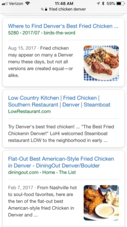
Going off of the last point, it’s important to actually add the menu items (the titles and descriptions) in your HTML. This allows Google Crawlers to find and read all of your menu items. In some cases, restaurants can actually rank for specific menu item searches. For example, when a you search “Fried Chicken Denver,” Low Country Kitchen appears on the first pag, in part because they have fried chicken menu items in the HTML of their website.
Don’t: Attempt to Replicate Your In-House Menu Exactly
This is similar to the previous tips, but it’s equally important to keep in mind. We understand the necessity to maintain consistent branding within your business. However, when it comes to designing a menu on your site, keeping content legible and accessible for everyone on all devices is even more vital. If you have a carefully designed static menu (with spacing and items designed for their specific spot on that space), replicating this design on the web will be both illogical and unfeasible. Not only will this design not look the same on all screen sizes (since it was designed for a known page size), but it may also fail to be legible, accessible web page in general. This could harm both the user experience on that menu page as well as your site’s overall SEO.
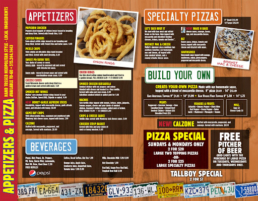
As you can see, replicating a menu like this exactly would be a waste of time and effort. The items, sections, and images may fit well on a static, in-house page where the dimensions are known, but the web is a different story. Something like this would be completely illegible on a small screen, like an iphone, and would not respond well to adaptive larger screens either.
Do: Make The Menu Responsive for All Screens & Devices
It’s vital that your menu is accessible and easily legible on all devices. This means that the menu needs to adapt to different screen widths and look great on everything from a large desktop computer to a thin smartphone. Responsive content is a necessity for any page on a website, but it’s especially important to consider with your menus.
Don’t: Use Poor, Low Quality Images
If you don’t have nice images of your dishes, don’t feel obligated to use poor, pixelated photos. This can simply be distracting for users, especially if these images clash with an otherwise well-designed website. Holding off on images and just going with descriptions of dishes is sometimes the better call.
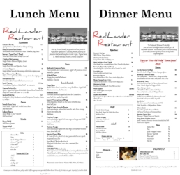
Do: Create Different Pages for Your Different Menus
If you have different menus for breakfast, lunch, dinner, and drinks, don’t be afraid to create different web pages for each of these menus. This can help the user access exactly what he or she needs without having to scroll excessively (if the menus were merged into one page). Plus, it presents further opportunity increase SEO for each of these search terms. For example, perhaps a user searches “bbq lunch denver.” Having your lunch-specific menu may help with ranking for this search term, or even simply guiding users to the correct page with their initial search.
Examples of Optimized, Well-Designed Web Menus
Here are a few links to menus that we have designed. These are high-ranking sites with accessible, responsive menu pages that exemplify the points above. Check them out!
Interested in a complete Google My Business guide for restaurants?